Here at Tailored Media, making our clients look good is just one of the team’s many talents. Although it may seem deceptively simple, achieving professional-looking headshots is quite a process!
Before you even start shooting, it is crucial that you have a clear concept and execution to move forward with. While shooting headshot pictures to add to a client’s website, we curated a handy list of tips to help ensure your photoshoots add value to your company’s unique brand identity!
Considering doing a photoshoot? Refine your ideas and get started with our photoshoot creative brief, available for PDF download (no registration required – just download it).
While shooting headshot pictures to add to a client’s website, we curated a handy list of tips to help ensure your photoshoots add value to your company’s unique brand identity!
Tips for professional-looking staff portraits:
Good lighting
According to Dane, our graphic designer, lighting is the biggest consideration when shooting photoshoots for our clients.
He recommends shooting in shadows during with daytime lighting or under a garage or car-port. Harsh lighting is undesirable, as it will distort facial features and cause unwanted highlights (no shiny foreheads over here, please!).
Also, harsh lighting such as broad daylight at noon causes distracting shadows. The intention is to present your company’s team as professional and so poor lighting will detract significantly from a headshot photo. Remember, the KEY objective is to present your crew with pictures that flatter their appearance and add to their reputability and authority, without distracting the viewer. On the other hand, soft lighting is IDEAL! This will illuminate facial features, without casting distorted shadows or creating harsh highlights.
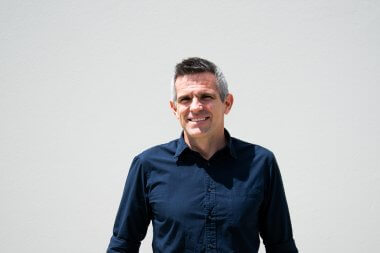
The photo below is an example of poor lighting, which casts a harsh shadow across the right-hand side of our subject’s face (plus, he’s squinting!). 
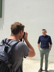
Here’s a behind the scenes shot, which shows the harsh noon lighting, which casts unwanted shadows:

Clashing Shirt Patterns
Shirts with small stripes appear distorted. Here’s an example of one of our team photos which highlights this issue!


The best attire for a company headshots is a bright block coloured shirt or professional uniform, preferably with the company logo present
Positioning
When shooting portraits, request that each person faces the same way (ie. slightly to the right, left of centre ect).
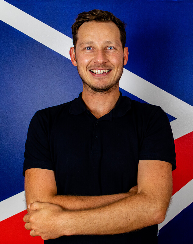
This not only creates a uniform appearance across a web-site but gives the impression of a united, team-based approach! For example, on our Tailored Team page, we’ve chosen to have each person stand left of centre, with a straight-on camera angle.
Although the posture varies amongst the team, with some arms crossed, this shows personality and allows a touch of individuality, whilst maintaining a consistent appearance.
Background
A similar concept applies to the background: you should aim to provide enough variety to maintain interest and personality, but keep all backgrounds across team portraits consistent with the business’ theme and brand voice.
A neutral background may be perfectly suited to some companies, whereas a crazy/busy background may add personality and intrigue to another!
Expressions
Expressions should be reflective of the business ethos. For example, when photographing the members of a law firm, their facial expressions should reflect seriousness, but the team should still appear trustworthy, personable and approachable. A fun tip our photographer has is to request that the person lifts their chin up and sticks their head forward (feels weird but does the trick).
Here are some final, edited photos from our recent shoot, which put into practice the techniques above:


Take Plenty of Photos
You can never be truly sure which moment is perfect to capture. So take plenty, and be selective later! That’s the beauty of digital cameras these days, nothing is wasted!
And of course… Be friendly and put your subjects at ease!
When people feel comfortable, they will be more cooperative and demonstrate more of their personality! This also translates photos which appear less “staged”, and more authentic, which in turn causes your brand to appear genuine.
Happy snapping!
Cheers

