In a world that has become increasingly dependent on imagery, it’s no wonder Instagram is now a powerful platform for businesses.
Stories of brands and social media influencers who’ve built thriving businesses solely based on an engaged Instagram following are becoming more and more common. I’d dare to say such success was not through pure luck, but a keen eye for curating an eye-catching, appealing Instagram feed that has converted viewers into loyal followers.
So, what does it mean when I talk about curating a feed?
A user’s first impression of your Instagram feed is in the first three rows of your grid, and the aesthetic of this is integral to converting a viewer into a follower within a matter of seconds. Choosing images that complement each other allows the eye to move freely through your feed without interruption.
How do we achieve an aesthetic?
A clean, attractive feed is achieved by three key factors:
- A consistent colour scheme
- Space
- Variety
Let me take a little more of your time, and elaborate on these for you.
Consistent Colour Scheme
A consistent colour scheme is achieved by choosing three or four key colours, and sticking to them. This is seen through the choice of content, being for example, a blue sky, or a wooden tabletop, and the editing, which is up to the photographer (believe it or not, editing, also known as colour-correcting, plays a huge role in the mood of a photograph. But that’s for another conversation.)
Depending on your brand and the mood you wish to convey, your colour scheme could be warm and cosy, cool and moody, monochromatic, or bright and colourful.
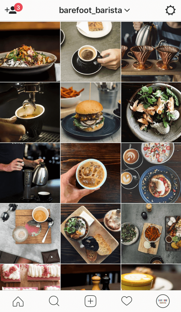
Take for example, Barefoot Barista’s Instagram feed. I can point out already that their key colours are grey, deep browns, and pops of yellows and pinks. The overall aesthetic has a moody manliness to it, to suit the interiors of the cafe and their rustic menu items.

Space
Creating space in your grid is essential to helping the eye move freely throughout your feed. I’m not talking about borders or gaps here, but simply making sure “busy” images are scattered amongst not-so-busy images.
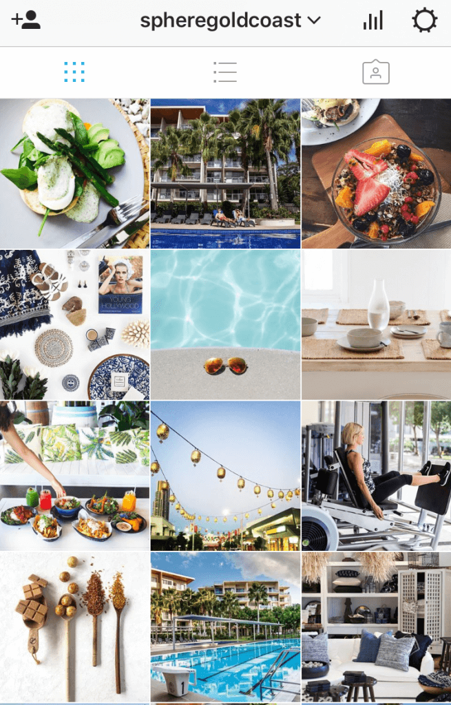
For Sphere Gold Coast, we created space by using simple, minimalist photographs every few posts, which helps to break up the content and give the busier photos room to breathe.

Variety
As an avid Instagrammer, I cannot say this enough – posting the same thing (even if it’s from a different angle) two, three, four times in a row, is a big no-no. I’m looking at you, selfie addict.
Variety creates interest, and interest translates to followers, and followers become customers. You got an awesome new handbag you’re selling and want to tell all of Instagram about it? Great! Now post it. Just once. Then post a few other products you may be selling, or generic photographs or graphics that fit with your brand and that all-important aesthetic we were talking about before.
A few rows later, give the handbag another plug; but in a different photo of course, be it another angle, or someone wearing the handbag.
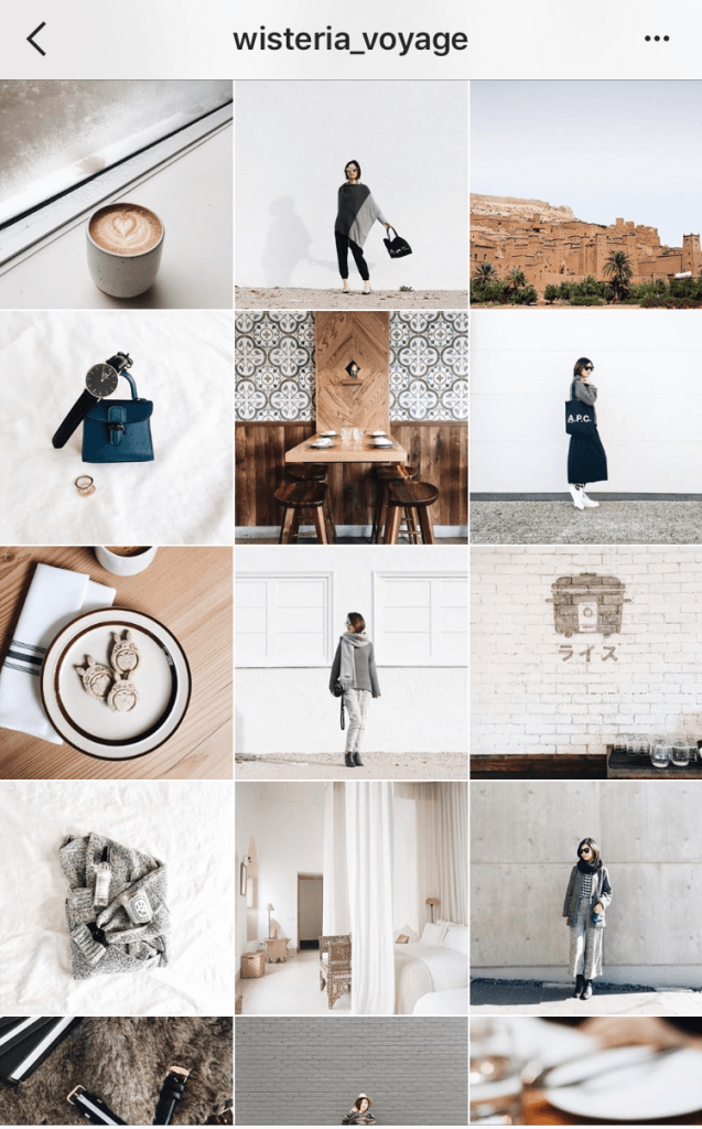
Lifestyle blogger @wisteria_voyage’s feed is a perfect example of this, as she scatters photos of herself, food, interiors and travels throughout her grid to create visual interest.

I’m freaking out. I don’t have mad Instagramming or photography skills!
Freaking out because you’re not a creative? Calm down, Charlie Brown. The great news is, it’s not all about being an awesome photographer. Although having a professional photo shoot helps, and we highly recommend it, the key is to make sure the “bigger picture,” that is, your grid, is neither overwhelming or boring.
Curating an Instagram feed takes a lot of hard work and dedication to the vision for your brand. But with the opportunity to cultivate a devoted following and customer-base, the rewards can be great.
Cheers

